Bootstrap is a popular CSS framework and a powerful tool for building responsive websites. It provides a collection of pre-built CSS classes that can be used to create consistent and visually appealing layouts across different devices. If you want to explore more about Bootstrap, you can also join web development course provided by CITC-The Hub of IT. But first let’s discover the key points to create responsive layouts with Bootstrap.
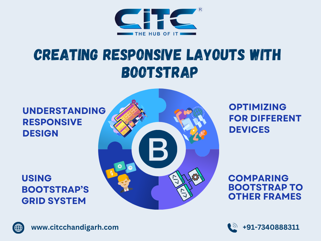
1. Understanding Responsive Design:
Responsive web design aims to make web pages look good on all screen sizes, from small mobile phones to large desktop monitors. It is achieved through techniques like fluid grids, flexible images, and media queries. Rather than creating separate layouts for each device type, responsive design allows a single layout to adjust itself based on the user’s screen size. The main principle of responsive design is to verify that content changes without losing clarity or usability.
2. Using Bootstrap’s Grid System:
One of the best features of Bootstrap is its grid system, which makes responsive layout creation easy. An 12-column grid structure is used, which can be easily customized to fit different screen sizes by using predefined classes.
3. Optimizing for Different Devices:
Optimizing for different devices Bootstrap’s grid system helps with the basic layouts. It’s essential to improve and optimize your designs for specific device categories includes:
Mobile-first Approach
Mobile devices automatically optimize designs in Bootstrap. You can add styles for larger devices on demand. This gives mobile users a fast and smooth experience.
Media Queries
Bootstrap offers predefined breakpoints, you might want to modify specific elements for particular devices using unique media queries. This allows you to control font sizes, padding, and other styles based on screen dimensions.
Images and Media
Responsive images and videos are essential for performance on smaller devices. Using Bootstrap’s .img-fluid class you can verify images scale according to the screen size without overflowing. Lazy loading is another technique that can improve page performance on mobile devices by loading media only when it is visible on the screen.
4. Comparing Bootstrap to Other Frameworks:
Bootstrap is a popular front-end framework, known for its ease of use, extensive components, and responsiveness. Compared to others like Foundation , Bulma, Tailwind and Materialize, Bootstrap is good in providing quick basic models, beginner-friendly features, and strong community support.
It is a powerful tool for creating responsive layouts. Its ease of use and strong documentation make it ideal for both beginners and experienced developers alike. With a solid understanding of responsive design principles and Bootstrap’s grid system, you can create layouts that look great on any device, ensuring an effortless experience for all users. So, what are you waiting for . Join web development course with CITC-The Hub of IT. and take your web development career to new heights.
JOIN NOW


